
Font style - another style that helps determine the overall look of your layout. Fonts are a way to show emotions on a written page. They can be whimsical, serious, classy, you name it! There are several fonts out there, some are free, but the downside is that they don't all go together on the same page. Any more than 2 (maybe 3) fonts on a page tends to make things look too busy, almost crowded. Now we are not talking about word clouds here, because those are more like elements. Many of the cool fonts that you see really don't work well together - remember - personality is great in small doses! Think of it like kids in a room - two or three are usually ok together, but as you increase the number, you are increasing the chance that something just isn't going to work. Other than seeing my two boys get along, the prettiest sight that I can think of is two fonts that go well together. I have been a graphic artist for years, done several ad campaigns and let me tell you, well thought out typography will make or break a campaign. On a scrapbooking layout, the use of fonts is not that serious, but a good font pairing can draw attention to your photo. Body copy will describe the photo on your layout, but the judicious use of a display font can really make your page pop.
Your mission - if you choose to accept it, is to use Orange LET and pick another font that goes with it to use on a layout.
Orange LET is a great body font, but it is also a little funky and it would make a good title font - your choice here! There are several fonts in our store to choose from, there are also tons on the internet, or you can even use a second font that you already have. I just want you to use more than one font on a page and still have your photo as the main focus. Not as easy as it sounds, but this is a great exercise for a digital scrapper :)
A basic hint for you: Serif and Sans serif fonts tend to work well together. Also, there are basic guidelines for typography, not rules. A few of those basic guidelines -
1. Capital letters can give your words punch, but all caps is difficult to read. 2. Make sure it is readable! If not, the viewer will be focused on trying to read, not looking at your beautiful picture!
3.


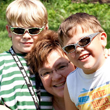
Here's my layout for this challenge - I used Orange LET for the body copy and FFF Tusj for the title (I also used Rock Show Whiplash to give that feeling of Rock music)

Credits: Starter Seeds - Portrait Style Pk 1 by CT Designs and Create, Inspire, Play GP by Urban Wings Artography
Kim has made font pairing super easy with her line of fonts in our shop. She uses classic principles and the fonts go beautifully together. No guesswork here!

![photo[1]](http://thecreativepixel.com/wp-content/uploads/2013/08/photo1-150x150.jpg)
![photo[2]](http://thecreativepixel.com/wp-content/uploads/2013/08/photo2-150x150.jpg)
![photo[3]](http://thecreativepixel.com/wp-content/uploads/2013/08/photo3-150x150.jpg)
![photo[4]](http://thecreativepixel.com/wp-content/uploads/2013/08/photo4-150x150.jpg)
No comments:
Post a Comment